Colour design for interior spaces
Anyone renovating a house has to choose colours at some point.
Decisions on colour don’t incur extra cost and aren’t a special luxury.
Those kind of decisions always have to be made, because every visible element of the building has a certain kind of colour: The windows you install, the floors you lay, the wall that has to be painted.
What colours will eventually be used for walls, floors and other surfaces, is your decision.
White is not a law of nature, but rather a decision made by the person building a house. Additionally it is only one colour of thousands available to you.
Colour design for inside spaces
How do you judge good room design in terms of colour?
- A good colour concept improves the quality of stay in a room.
- It gives strength to any person within the room and gives you a feeling of being in the right place.
- When someone emotionally connects with a room, said person very often likes to unfold their creative powers within that room. Rooms that seem alien and with which a person doesn’t identify, hinder the creative powers of a person.
- Following that idea, colour can not only improve workflow and intuitive acting, but also, depending on the way the room is put to use, stimulate communicative processes and support regenerative processes.
- The clever use of colour balances out unfavourable influences on a room, so that they are less disturbing.
How do you recognize a less successful concept?
- The colour is not appealing to the user. The design doesn’t “talk” to him or her. If the user doesn’t experience joy in letting his eyes wonder around the room, something is wrong. Very often this is due to too much white in the room, or a monotonous concept as a whole.
- You also come across the other extreme: The room overcharges the user, his attention is drawn between too many aspects. What sense does stress make, if all the sensual sensations don’t create any deeper intimacy? If the user can’t engage with the room emotionally or even doesn’t want to?
As specialist planners for colour we will make the right decisions on colour for you build project in collaboration with you.
So that you, your family, your colleagues, parters, clients or guests feel at home in your rooms.
The whole spectrum of colourful rooms:
Colour has an effect
and to what effect we use colour
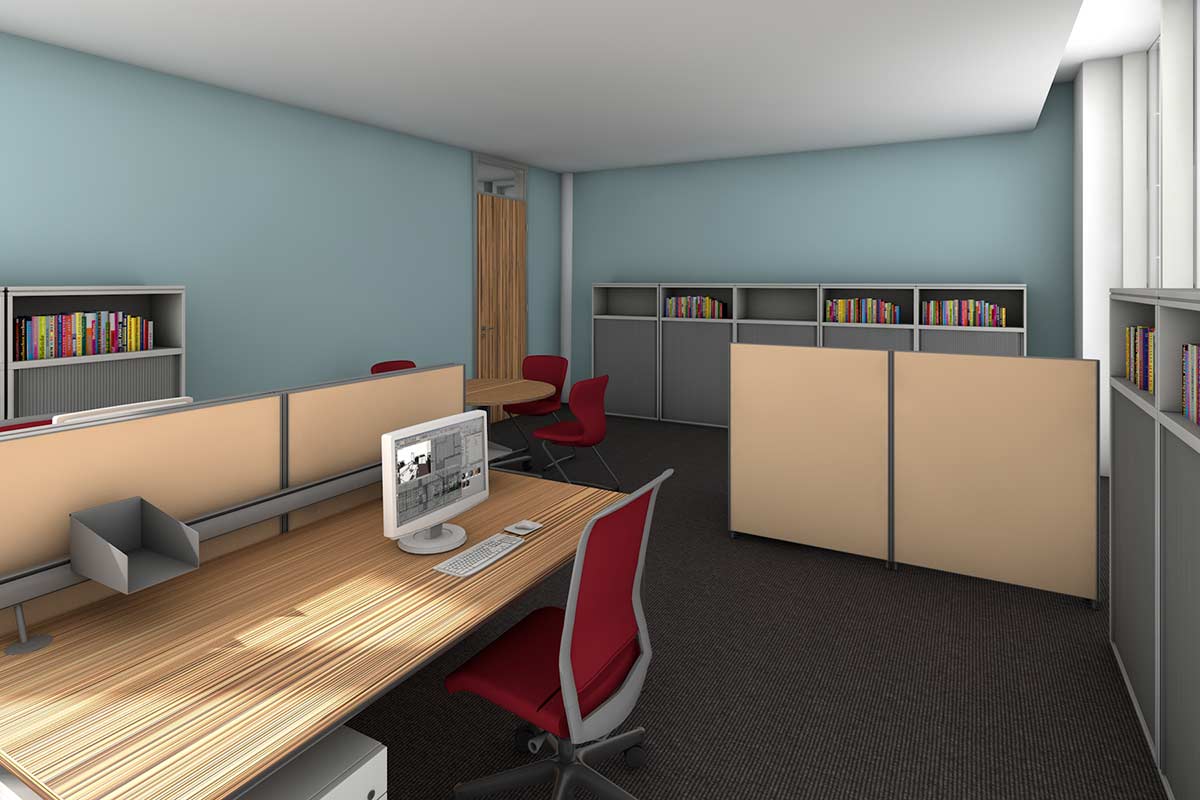
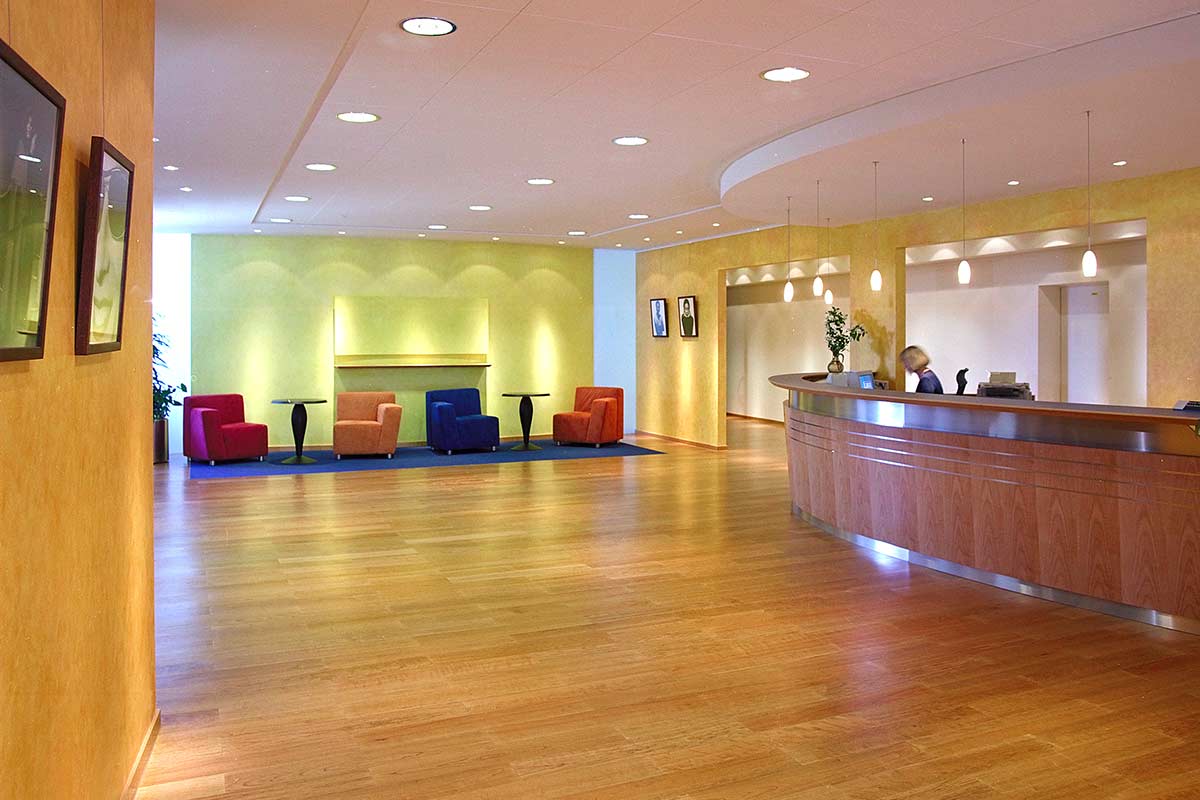
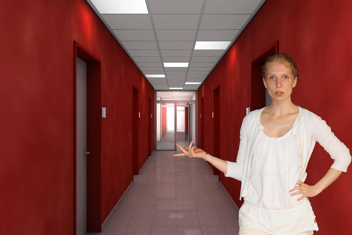
Colour at the workspace
Making employees happy
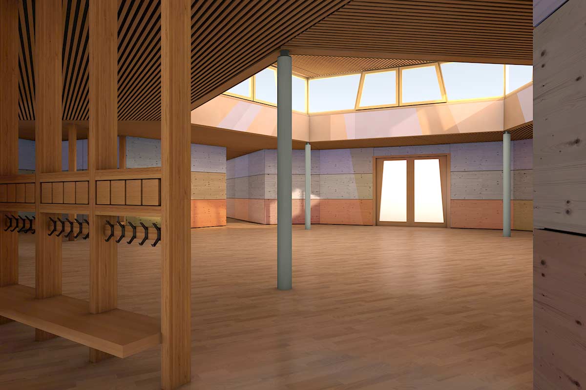
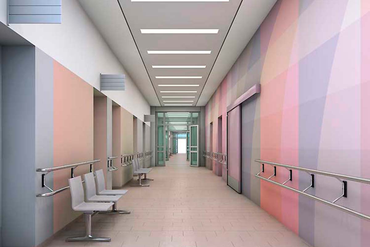
Public buildings
a large “colour-construction site”
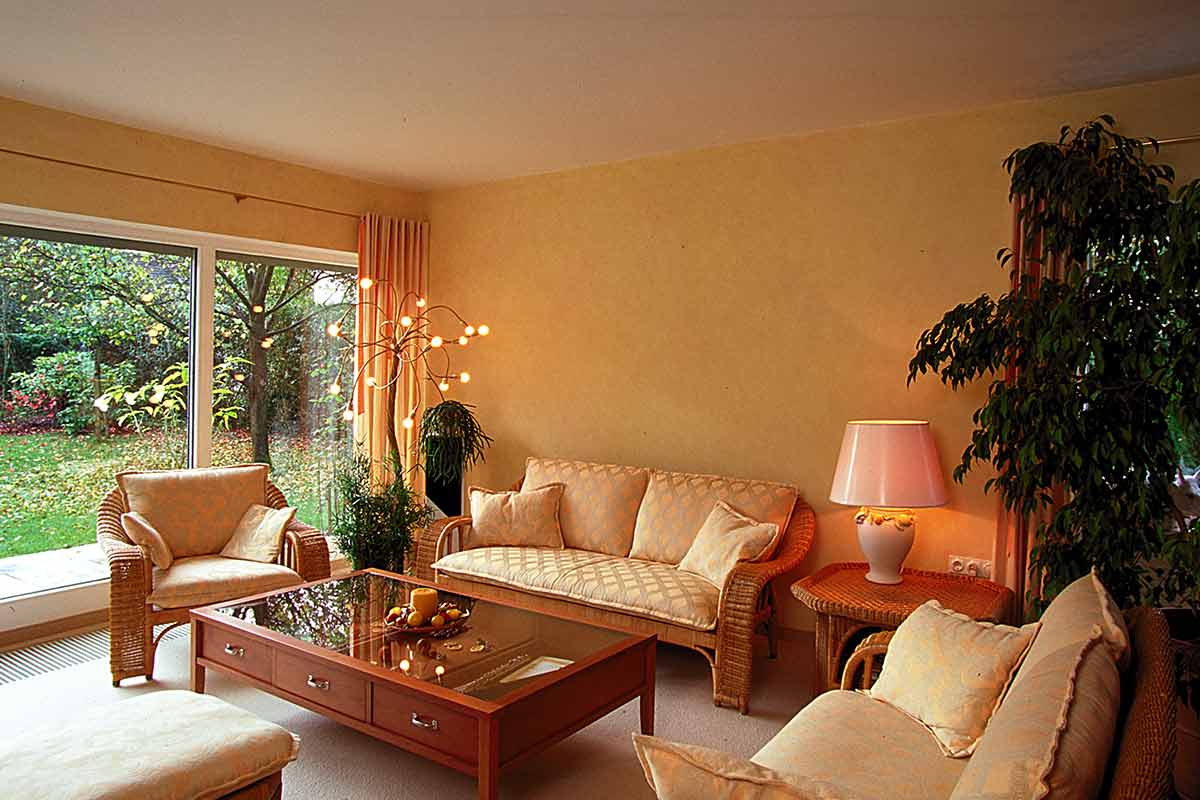
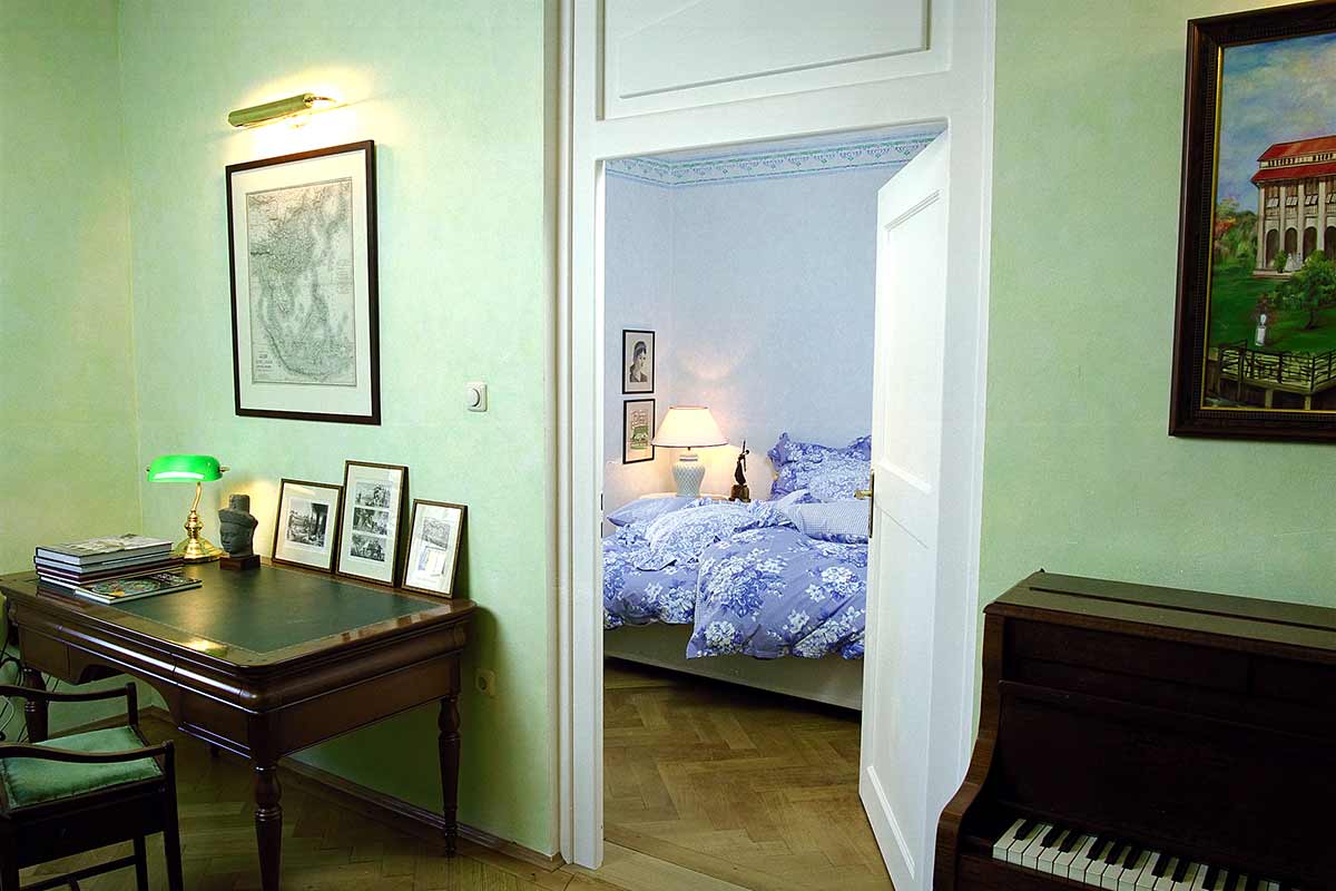
My living colours
easy to find!
Athmospheric wall glazing techniques
for “open to light” colours
Show me what it will look like!
Make colour ideas visible
The psychology of colours
Superstition or science?
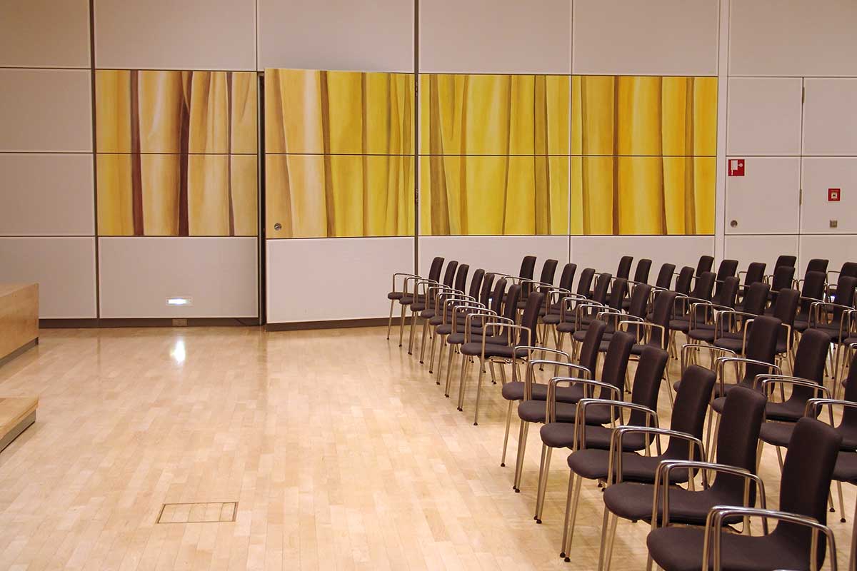
Colours, Paintings, Rooms
artfully designing
Analysis, empathy, intuition: Martin Benads Book : “Farbgestaltung Innenraum” (Colour design for inside spaces)
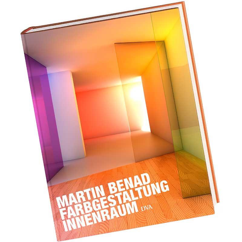
Marting Benad and Jürgen Opitz display their expert knowledge in their book “Farbgestaltung Innenraum”. They develop the basis of both empirically proven and creative-empathic design theory. The reader receives a key, so to speak, that unlocks the complex topic of “colour design for inside spaces” in different aspects and translates it into planning advice. The 176 pages long book with an added sample swatch sets new benchmarks in the area of professional colour planning.
It conveys strategies for synthesis of scientific precision, psychological empathy and artistic creativity.
Martin Benad, Farbgestaltung Innenraum mit Beiträgen von Jürgen Opitz, DVA, 2010 (German)