The colours of architecture
"People experience a great delight in colour, generally. The eye needs colour as much as it needs light.” (J.W.Goethe)
The prime subjects of perception are atmospheres…
Atmosphere is the combined reality of a person perceiving something, and what they perceive. (Gernot Böhme)
It’s impossible to more accurately describe why exactly we are professionally active as specialist planners for colour, than by reading Gernot Böhme’s book “Atmosphäre” (Suhrkamp 1995) or J.W. Goethes “Farbenlehre” (1810,§ 759). We could however try to summarise a little:
- We want people to enjoy the atmosphere in their buildings.
- We want your building to spread happiness.
The area of architectural colours is taken care of by Martin Benad and Jürgen Opitz (Architect Dipl.Ing.)
For more information please visit our website at www.farbenplanung.de.
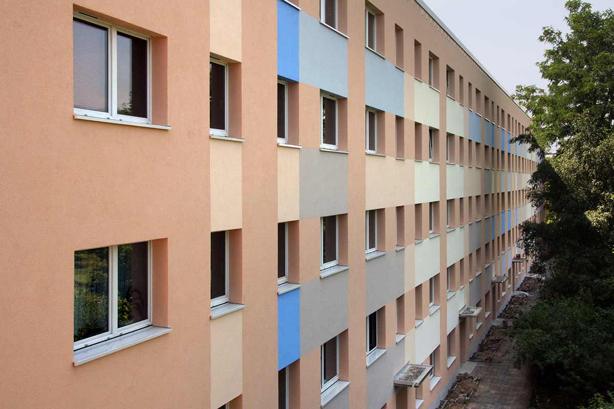
The whole spectrum of colourful outside rooms

We don’t copy nature, we try to recreate it.
“Familiar surroundings” instead of inhospitable cities
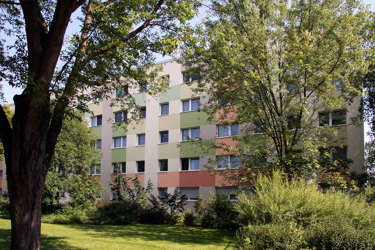
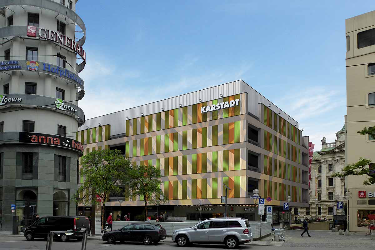
Nature doesn’t know large monotonous planes. In architecture however they will repeatedly be found, for example in the form of white or grey facades. The very often seem repelling, dull, disconcerting.
We love working with polychromatism, to make the appearance of buildings more susceptible to the human eye and to bring them to life. We finely coordinate the polychromatism in evenly tuned musical tones, using the laws of colour tonal harmony.
With the help of said tones we translate the spatial (serial) construction raster into a temporal (rhythmic) process. Such a nature orientated “organic colouredness” has nothing to do with soft transitions of natural forms, because the colour scheme follows the clear forming principles of architecture. It does however create an impression that seems natural and emotionally closer to the viewer in comparison to a large, unstructured area. We especially use this effect to counteract estrangement in monotone functional buildings.

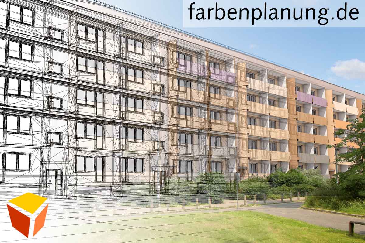
1.Technical planning for a world beyond your senses.

2.The colourfulness of this alpine panorama shows a natural colour scheme, familiar to humans in its order from light to dark, cool to warm and powerful, grey tones.

3.We reduce the whole landscape painting to a limited amount of clearly divided colour tones organised in a mosaic-like fashion.

4.The colour mood of the mosaic painting is supposed to relate to the forming principles of the build structure. Single colour tones are weighted more heavily, others less and the total number of tones is reduced. The wavy form of our visualisation is meant to show: “The landscape atmosphere is blown against the building..”

5.We did not paint a mountain panorama on the wall; the wall has remained as a wall visually. Neither a camouflaging mimicry, nor a flashy decoration would be in accordance with the constructional situation. Only the mood has changed. THe wall is “closer to the people”, because it caters to the need of having a natural and familiar surrounding.